1. Where to find project planning report
Select projects on the top navigation bar.
Click on planning to access the planning report page.
Project planning is critical in guiding stakeholders, sponsors, teams, and the project manager through the many phases of the project.
Creating and managing teams on SenseFlow is a quick and flexible process. It gives you the power to decide your team's needs, objectives, and composition. Our planning and tracking tool helps you optimize your project's performance.
SenseFlow makes project planning faster and simpler, no matter where you are.

Select projects on the top navigation bar.
Click on planning to access the planning report page.

With the date range selector, you are able to get a to filter through the time period that gives you the chance to view team members within under the project details.
The section is highlighted will show the given information that’s being displayed within the specific time frame on the screen.

Allocated hours show an overall estimation of the time that will be spent on this project. Captured hours show the members' overall captured hours.

If you click on the drop-down arrow, you will have a bar graph that visualises the allocated hours compared to the capacity for the selected period. The months are on the x-axis (bottom), the hours are on the y-axis (left).
The green bars on the graphs are the confirmed hours, and the blue bars are the tentative hours captured.

If you click on the drop-down arrow, you will have a bar graph that visualises the paid hours and unpaid hours for the selected period. The months are on the x-axis (bottom), and the hours are on the y-axis (left).
The dark blue bars on the graphs are the paid hours, and the lighter blue bars are the unpaid hours.

If you click on the drop-down arrow, you will have a bar graph that visualises the confirmed and captured hours for the selected period. The months are on the x-axis (bottom), and the hours are on the y-axis (left).
The dark blue bars on the graphs are the captured hours of the team, and the light blue bars are the confirmed hours.
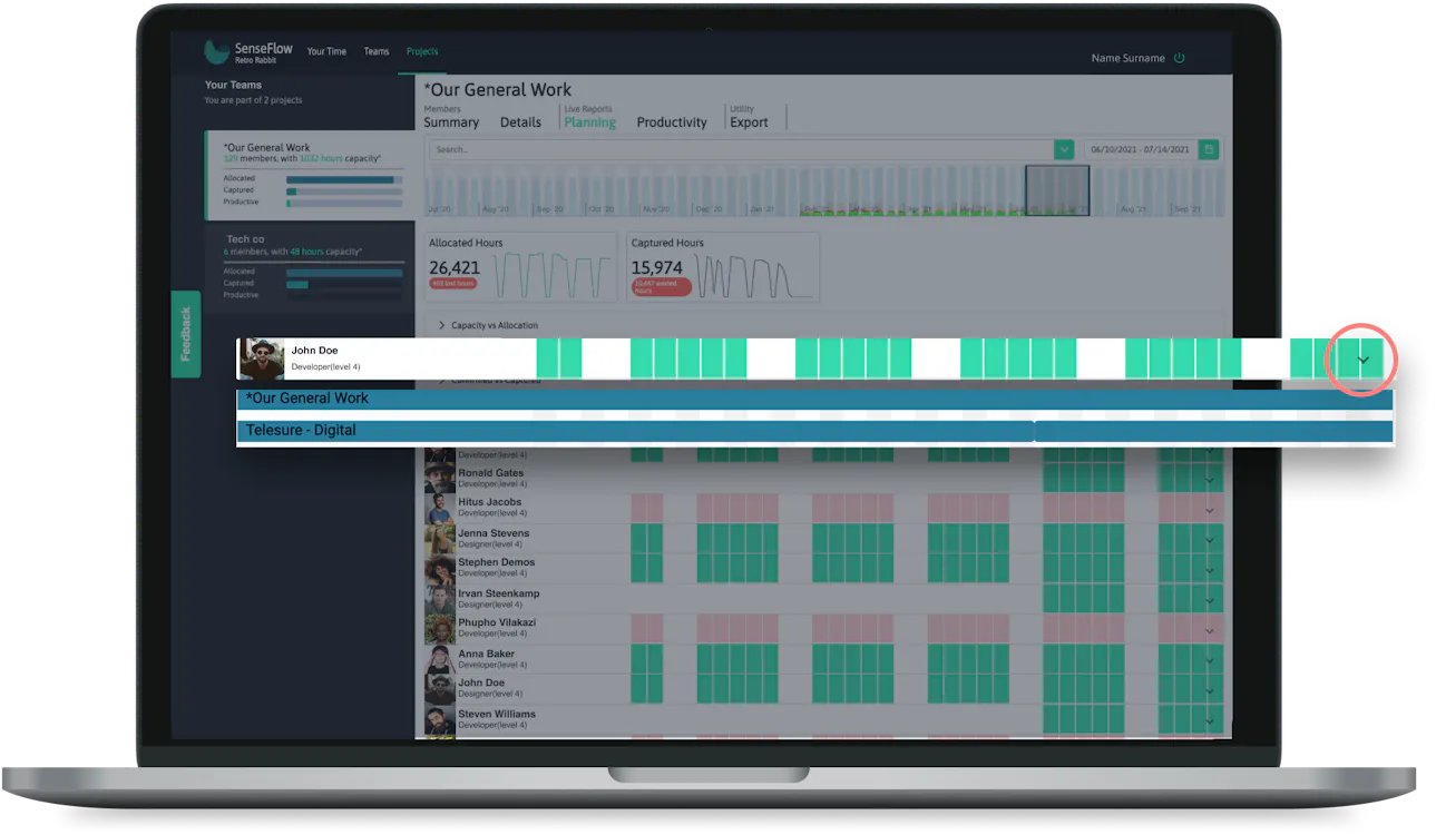
Shows details of the individual for planning like their full name, role, and a visual representation of their occupation during a certain time period. When the member is selected you will be able to see a detailed view that shows the projects that an individual is allocated to during the period selected.

Click "projects" on the top navigation bar.

Select the project you want to view.

Select "planning" under live reports.

You can drag the bar on the date range to filter and view information for a certain period.

Click on the dropdown arrow of the capacity vs allocated bar to expand and view the graph.

Click on the dropdown arrow of the paid vs unpaid bar to expand and view the graph.

Click on the dropdown arrow of the confirmed vs captured bar to expand and view the graph.
Dragging the period selected will display information in the graphs for the selected period.

Click on the dropdown arrow on the right of the member card to expand members and view the specific individual's information for planning. You can view the projects the member is allocated.

Click on the dropdown arrow on the search bar to view filter options, or you can start typing a specific member name, role, level, or skill. The member cards will be filtered by selected tags.

You can select from the dropdown more than one filter option. The filter options selected will appear in the search bar. To remove a filter "tag" you can click on the X to delete it.