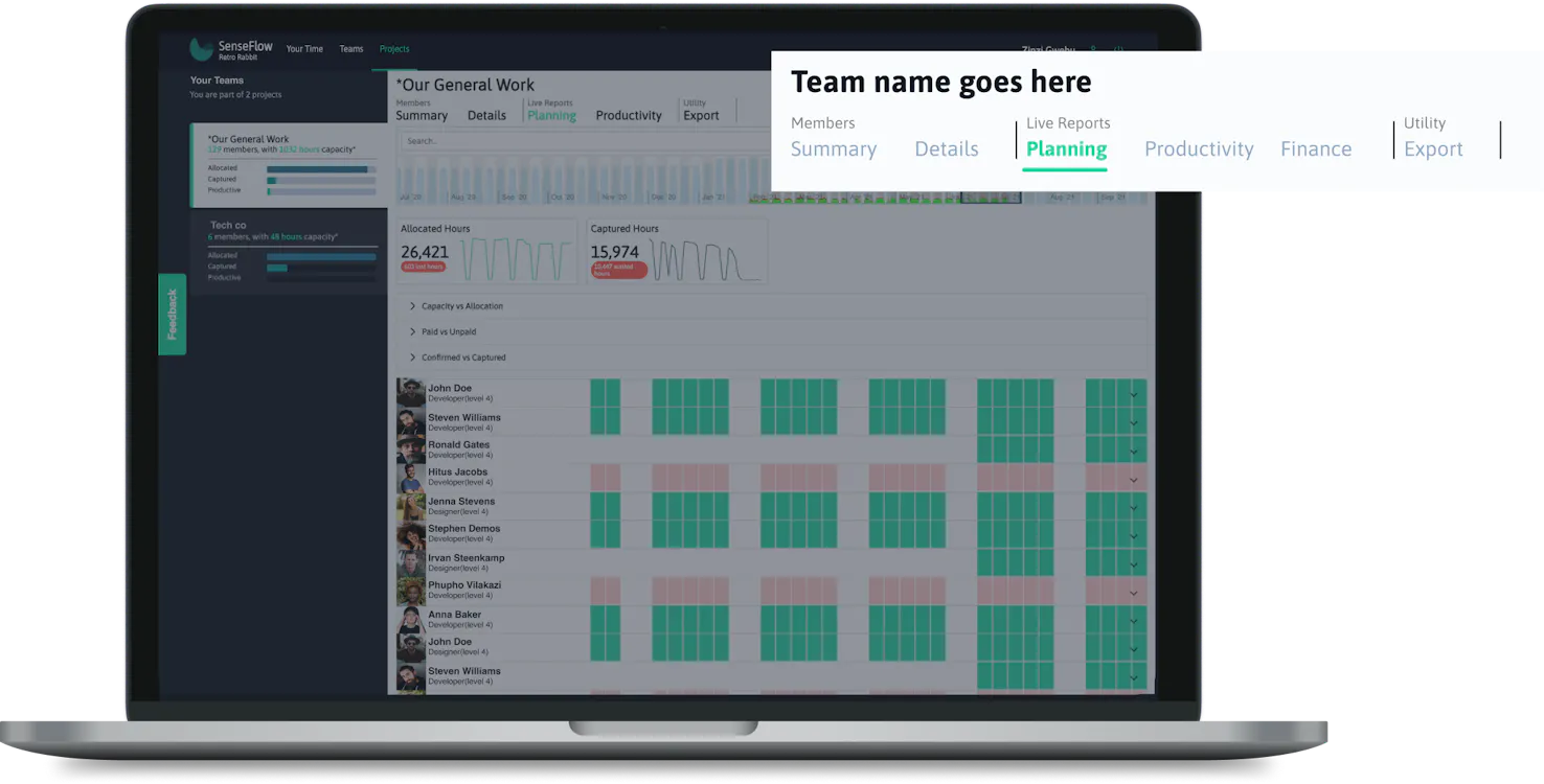
1. Where to find project planning report
Select teams on the top navigation bar. Click on planning to access the planning report page.
The details of each team's planning are accomplished with the use of Sense Flow's distinct data visualized team planning reports. The different sets of data displayed include hourly indicators that display the allocated and captured hours monthly. It also visualizes capacity vs allocation that displays the differences between the capacity of a user as well as the allocated hours on that user for a specific month. Sense Flow also allows teams to plan financially through the paid vs unpaid data graph. SenseFlow has understood the logic and relationship of these different metrics and includes the teams' teams captured vs confirmed hours with those that have been captured.
Select teams on the top navigation bar. Click on planning to access the planning report page.
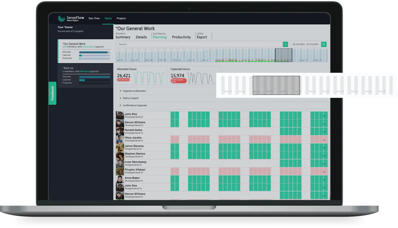
SenseFlow provides you with a date selector. The date selector is meant to allow users to sift through the data in accordance with the time frame they have selected.
With the date selector, users are able to drag, or even increase and decrease the width of the highlighted area according to the time frame they wish to view this data.
The highlighted section shows the information that belongs to a specific time frame. You will be able to select the time period that you would like to view within the team planning report.
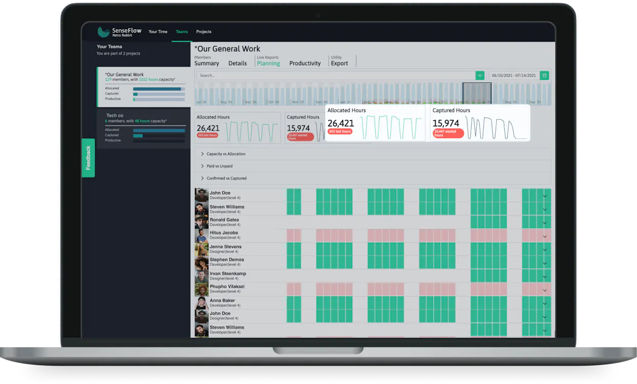
The highlighted section is a data visualized comparison between the two main metrics. An accordion is provided to delve deeper into these metrics.
Allocated hours show a team's overall estimation of the time that will be spent in this team. Captured hours show a team's overall captured hours.
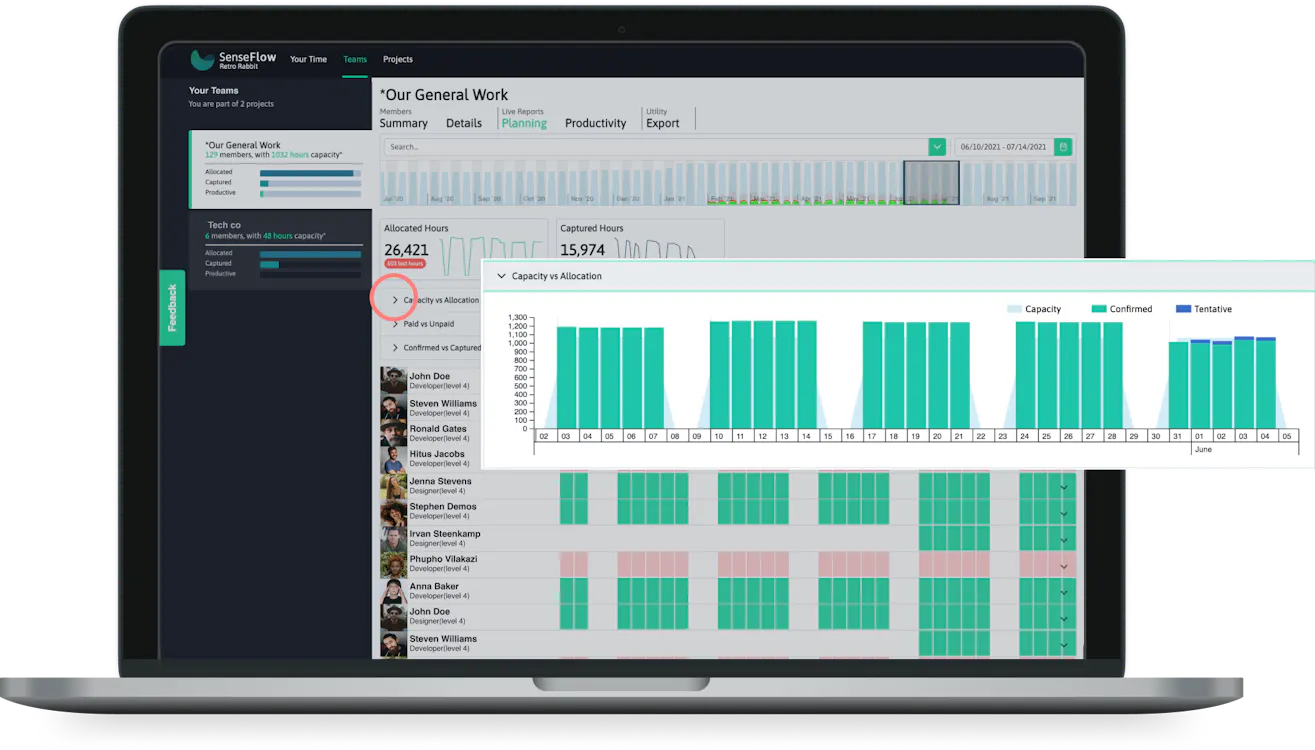
If you click on the drop-down (in the accordion), you will have a bar graph that visualizes the team’s allocated hours compared to the capacity for the selected period. The months are represented on the x-axis (bottom) and the hours on the y-axis (left).
The green bars on the graphs are the confirmed hours and the blue bars are the tentative hours captured.
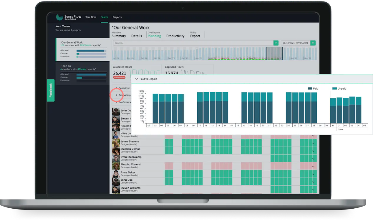
If you click on the drop-down arrow, you will have a bar graph that visualizes the team’s paid hours and unpaid hours for the selected period. The months are represented on the x-axis (bottom) and the hours on the y-axis (left).
The dark blue bars on the graphs are the paid hours and the lighter blue bars are the unpaid hours.
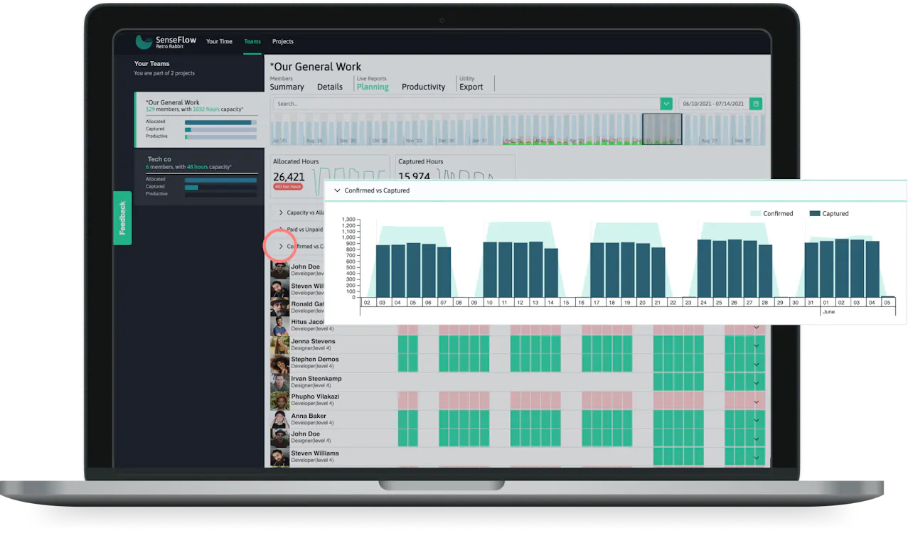
If you click on the drop-down arrow, you will have a bar graph that visualizes the team’s confirmed vs captured hours for the selected period. The months are represented on the x-axis (bottom) and the hours on the y-axis (left).
The dark blue bars on the graphs are the captured hours of the team and the light blue bars are the confirmed hours.
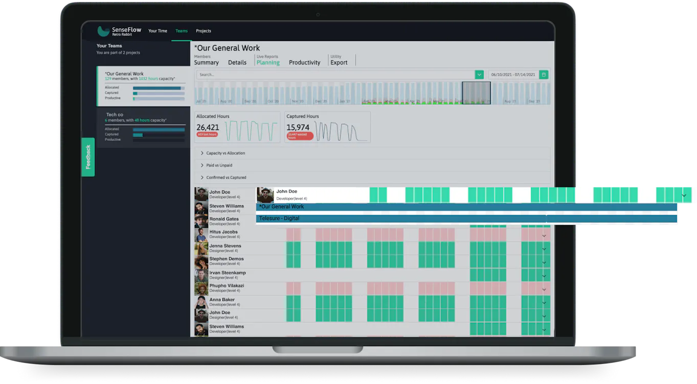
Shows details of the individual for planning like their full name, role, and a visual representation of their occupation during a certain time period.
When the member is selected you will be able to see a detailed view that shows the projects that an individual is allocated to during the period selected.

Click on the dropdown arrow on the search bar to view filter options, or you can start typing a specific member name, role, level, or skill. The member cards will be filtered by selected tags.

You can select from the dropdown more than one filter option. The filter options selected will appear in the search bar. To remove a filter "tag" you can click on the X to delete it.

Select teams on the top main navigation bar then click on planning in the secondary menu to access the planning report page.

You can either select the two endpoints of the highlighted area and drag them OR you can select the date range from the date picker next to the search bar above.

Click on the dropdown arrow of the capacity vs allocated bar to expand and view the graph.

Click on the dropdown arrow of the paid vs unpaid bar to expand and view the graph.

Click on the dropdown arrow of the confirmed vs captured bar to expand and view the graph.
Dragging the period selected will display information in the graphs for the selected period.

Click on the dropdown arrow on the right of the member card to expand members and view the specific individual's information for planning. You can view the projects the member is allocated.