Teams Productivity Report

Importance of effective team management is a crucial part of employee engagement, as it can also improve productivity, which ultimately contributes towards business growth and economic benefits. For this reason, we need to ask how teams are doing. SenseFlow shows you very simply who is being productive and who is not. Whilst productivity is important, we also show member satisfaction. Satisfaction and productivity combine to give you a sense of your team’s general wellbeing, and engagement. Managing these levels of productivity ensures a sustainable team.

1. Date range selector

SenseFlow provides you with a date selector. The date selector is meant to allow users to sift through the data in accordance with the time frame they have selected.

With the date selector, users are able to drag the or even increase and decrease the width of the highlighted area according to the time frame they wish to view this data.

The highlighted section shows the information that belongs to a specific time frame. You will be able to select the time period that you would like to view within the team planning report.

2. Export and Share Productivity Report

Sense flow allows you to export the productivity report for external use.

These buttons enable you to export the selected toggle information or share it via email.

3. Team Health Graph

Team health Allows us to get an overview of the team's performance during a specific time frame.

High-level metrics are visualised in a bar that shows the overall time allocated, captured hours, Unproductive hours, and productive hours.

The pie chart displays the average productivity and satisfaction of the team measured out of ten.

4. Team Insights

Each member gets productivity and satisfaction score out of 10 for the selected period. The top productive members are shown at the top under team insights.

5. Team Resources Used

Top skills and applications used within the project are displayed as clickable cards.

Selecting these cards highlights members in the grid (see 6) who are linked to these elements.

6. Team grid overview

The team grid shows all members that belong to a specific team. Members are distributed according to their satisfaction and performance score (out of 10).

You can view all team productivity reports to which you are allocated by using the project cards on the left side.

7. Member feed

Member feeds allow users to keep up with each other through the transparency of this feature.

Top member journal entries along with skills and applications used are displayed in members feed.

The card shows when the entry was created and how long the task took.

The green, orange and red tags indicate the satisfaction score value.
5 < red
5 > 7 orange
7 > green

8. Team Satisfaction

The line graph shows you the satisfaction of the team members for the selected period.

The x-axis is the period you selected, and the y - axis the satisfaction level out of 10.

Each team member’s satisfaction within the project over a selected period is represented by a line.
Selecting a line greys out other member’s lines and highlights the member selected.

The member card shows you their name, surname, satisfaction score and date.

9. Productivity Heat-map

The heat graph shows you the average productivity of the team for each day.

The x-axis shows the period selected, and the y - axis the days of the week.

Productivity is represented through colours:
Red = unproductive
Orange = neutral
Green = productive

Scores are measured out of 10 and assigned a colour.
5 < red
5 > orange
7 > green

10. Member Productivity

Member accordion provides a quick overview of the individual within the project. It shows you the member name, surname, email address and the badges they have earned. On their tab, you can also see the Allocated time and what has been captured (hours). You will be able to see the member’s focus score, satisfaction score and productivity score for the selected period. These scores are out of 10.

You can click the dropdown arrow to expand the member to view their personal data.

11. Member Time Metrics

The time bar indicates the member’s hours. It represents the individual’s allocated hours. The blue bar shows the number of hours they have captured, and the green bar shows you the number of hours they were productive out of the hours captured.

12. Member Productivity and Satisfaction Heat-map

The heat graph shows the member’s average productivity for each day.

The x-axis shows the period selected, and the y - axis the days of the week.

Productivity is represented through colours:
Red = unproductive
Orange = neutral
Green = productive

Scores are measured out of 10 and assigned a colour.
5 < red
5 > orange
7 > green

13. Member Average Metrics

Skill cards are found under the member’s personal data.

These cards show you the average hours they are productive, satisfied and focused. You will also be able to view which days of the week are most productive.

This helps you get a summarized view of the member’s working habits.

14. Member insights

You can view what skills the member most often uses within the project. The coloured bar is the hours spent using the skill.

Selecting a skill drops down and shows the top applications used for that skill and the hours captured using these applications. The “out of hours” is the member's total hours captured for the selected period.

The red bar and 3rd column indicate the hours the member was unsatisfied practising the skill. The orange bar and 4th column indicate the hours they were neutral. The green bar and 5th column indicate the hours they were satisfied practising the skill.

All three coloured bars combined are the time the member was productive.

15. Focus tracker

The circle graph indicated the member’s focus throughout the week.

The x-axis shows the hours, and the y-axis shows the days of the week.

The size of the circles indicates how focused the member was.

You can see what days and when during the day their focus increase or decrease. The more focused the individual was, the bigger the circle would be.

How do I access the productivity report?

In the secondary menu at the top just below the main menu, you will see a productivity report which you will have to click on to access that page.

How do I adjust the date range selector?

You can either select the two endpoints of the highlighted area and drag them OR you can select the date range from the date picker next to the search bar above.

How do I export or share a Team Productivity Report?

There are two buttons on the far top right of the screen which will allow you to export the selected team productivity information directly to your desktop or share it to a specific email address.

How does the Team Health Graph work?

The team health graph is below the date range selector which allows us to get an overview of the team's performance during a specific time frame. High-level metrics are visualized in a bar that shows the overall time allocated, captured hours, Unproductive hours, and productive hours. The pie chart displays the average productivity and satisfaction of the team measured out of ten.

How does the Team Insights work?

Each member gets productivity and satisfaction score out of 10 for the selected period. The top productive members are shown at the top under team insights.

What is the purpose of Team Resources Used?

Top skills and applications used within the team are displayed as clickable cards. Selecting these cards highlights members in the grid who are linked to these elements. This gives you a clear overview of resources a company should probably invest in.

How does the Team grid overview work?

You can select multiple cards at the top of the team grid from 'Top skills and applications used' or 'Team Insights'. Clicking on the cards will highlight in blue the members in the grid associated with the skills or applications used. These cards are the top team performers, skills, and applications used for the selected period on the date range.

The team grid shows all members that belong to a specific team. Members are distributed according to their satisfaction and performance score. You can view all team productivity reports to which you are allocated by using the project cards on the left side.

How does the Member feed work?

Member feeds allow users to keep up with each other through the transparency of this feature. Top member journal entries along with skills and applications used are displayed in members' feed. The card shows when the entry was created and how long the task took.

The green, orange, and red tags indicate the satisfaction score value.
5 < red
5 > 7 orange
7 > green

How team Team Satisfaction works?

The line graph shows you the satisfaction of the team members for the selected period. The x-axis is the period you selected, and the y - axis the satisfaction level out of 10. Each team member’s satisfaction within the project over a selected period is represented by a line. Selecting a line grays out other member’s lines and highlights the member selected. The member card shows you their name, surname, satisfaction score, and date.

How does the team Productivity Heat-map work?

The heat graph shows you the average productivity of the team for each day. The x - axis shows the period selected, and the y - axis the days of the week.

Productivity is represented through colors:
Red = unproductive
Orange = neutral
Green = productive

Scores are measured out of 10 and assigned a color.
5 < red
5 > orange
7 > green

How does Member Productivity work?

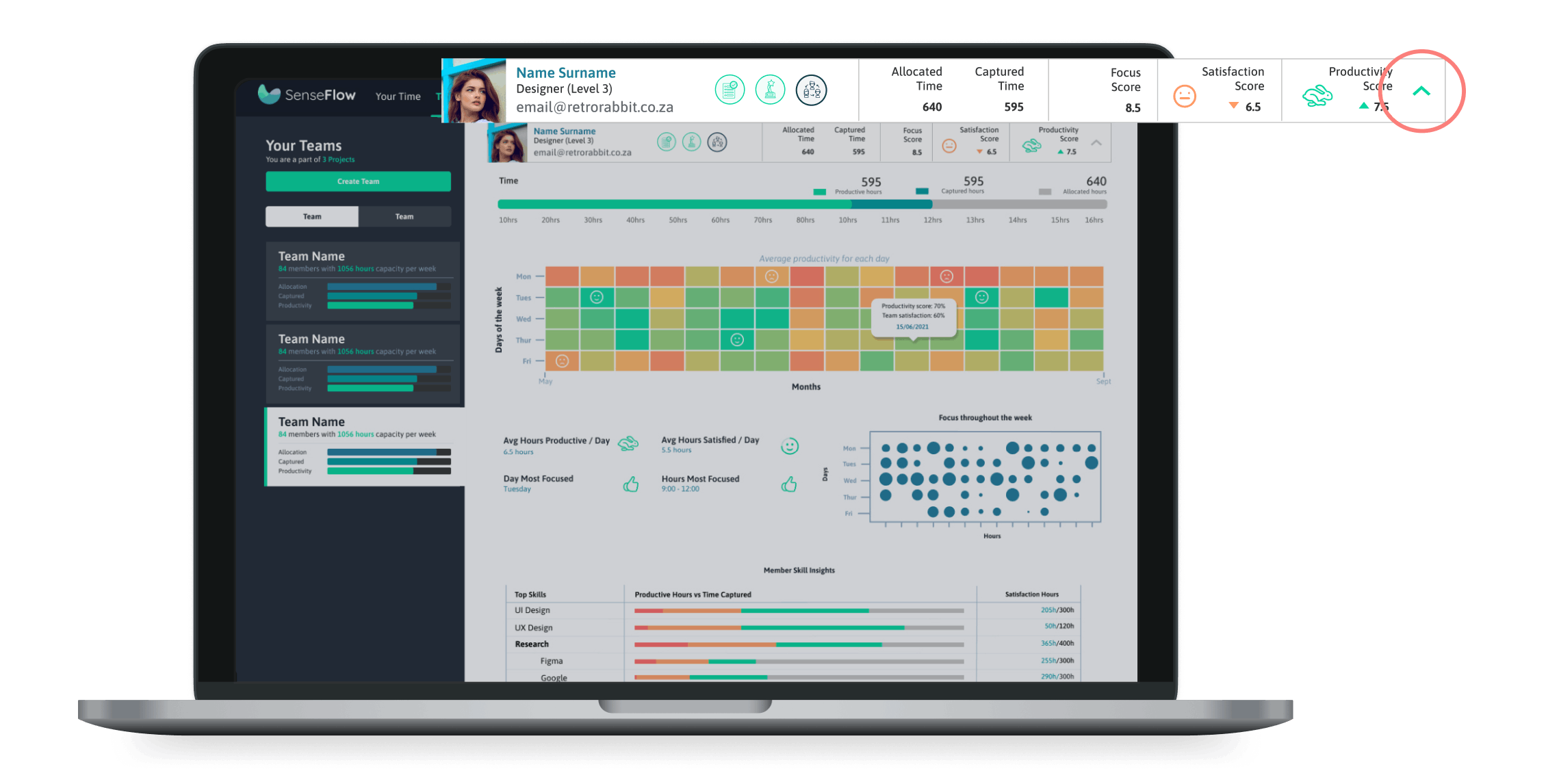
Before you click on the individual team member drop-down you will be presented with a quick overview of the individual within the team. It shows you the member's name, surname, email address, and the badges they have earned. On their tab, you can also see the Allocated time and what has been captured (hours). You will be able to see the member’s focus score, satisfaction score, and productivity score for the selected period. These scores are out of 10.
You can click the drop-down arrow to expand the member to view their personal data.

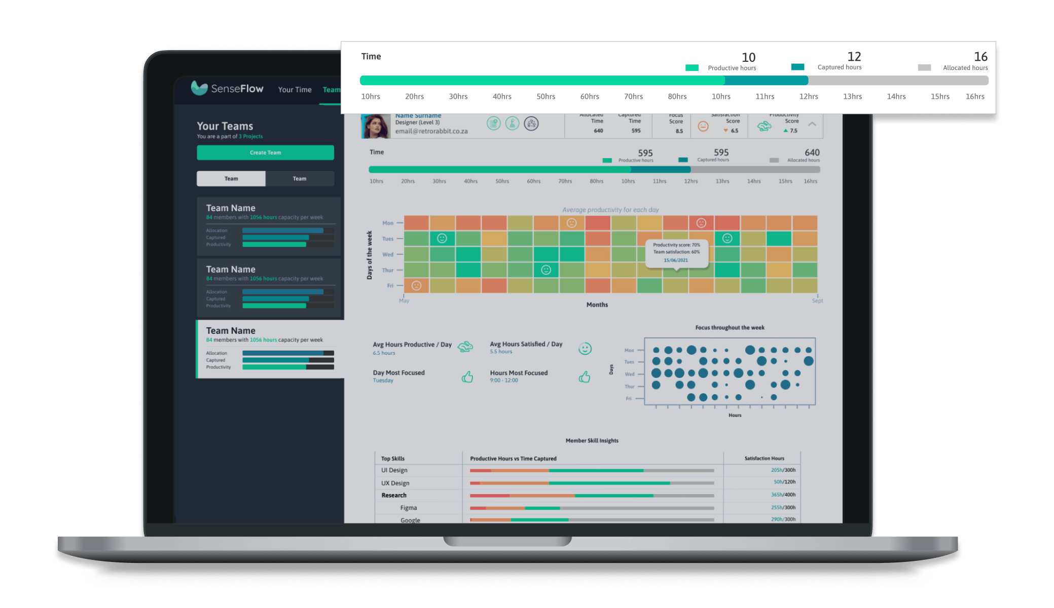
Once you have clicked on a particular member you will be presented with the time bar which indicates the member’s hours. It represents the individual’s allocated hours. The blue bar shows the number of hours they have captured, and the green bar shows you the number of hours they were productive out of the hours captured.

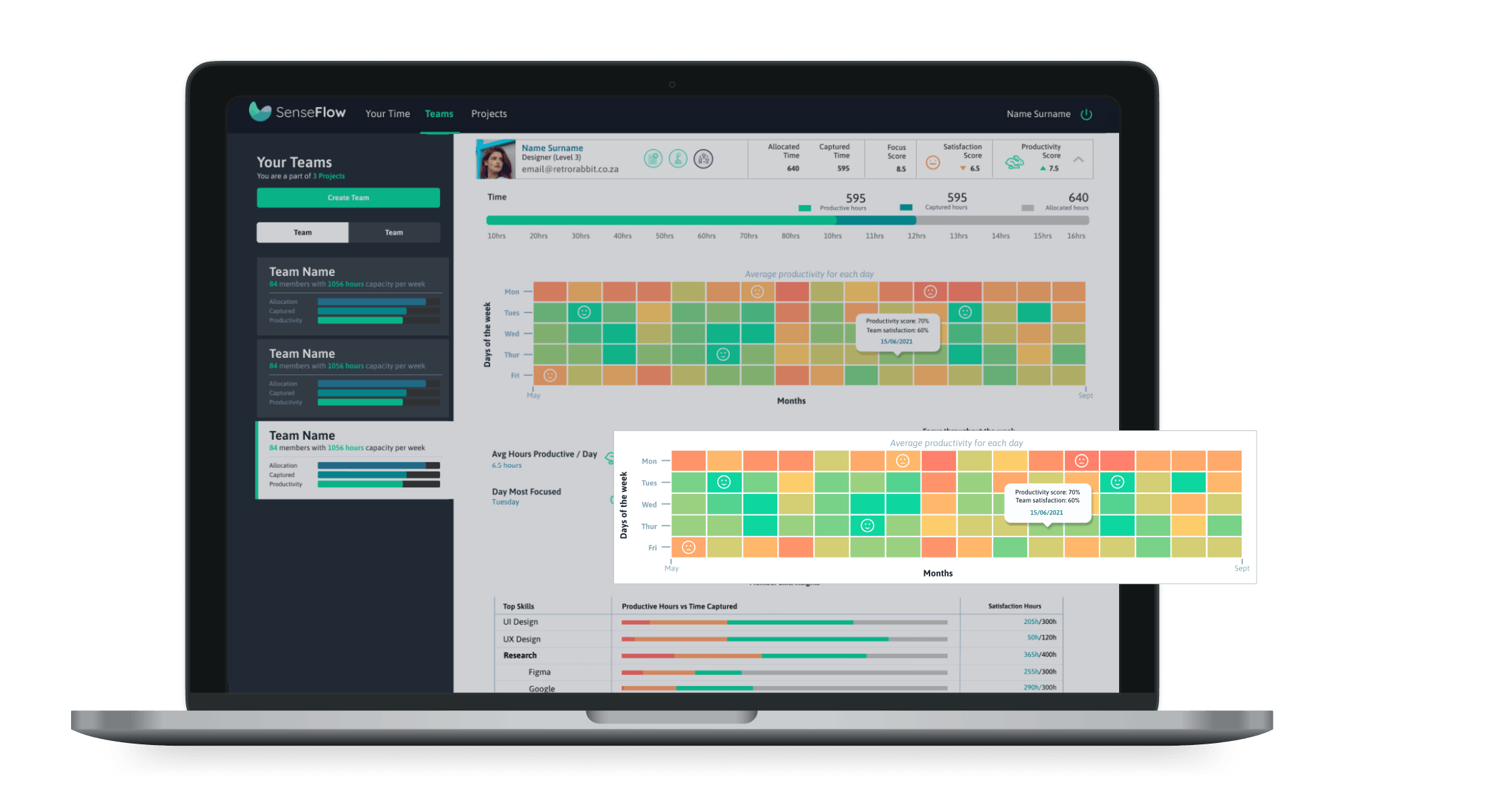
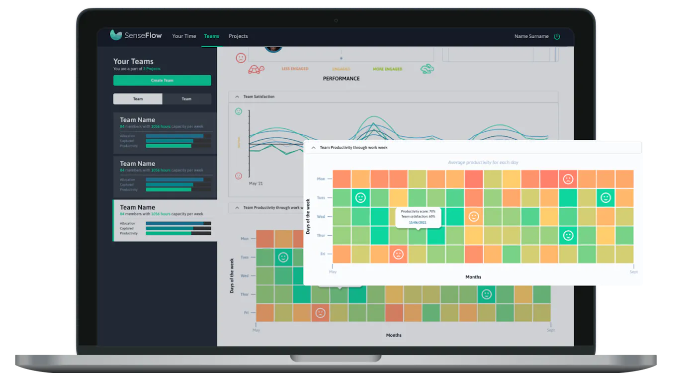
Below the time bar, you will find the heat graph which shows the member’s average productivity for each day.The x-axis shows the period selected, and the y - axis the days of the week.

Productivity is represented through colors:
Red = unproductive
Orange = neutral
Green = productive

Scores are measured out of 10 and assigned a color.
5 < red
5 > orange
7 > green

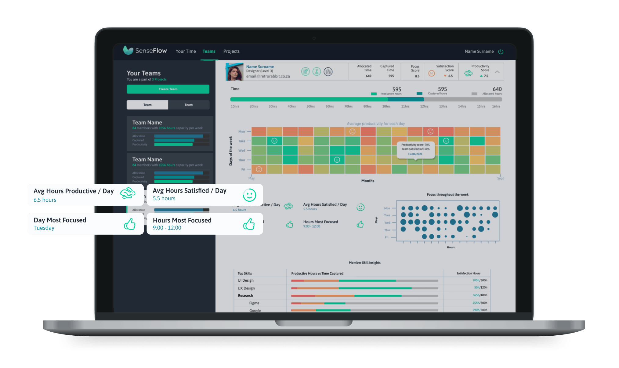
Below the Heat graph, you will be presented with some Skill cards. These cards show you the average hours they are productive, satisfied, and focused. You will also be able to view which days of the week are most productive.

This helps you get a summarised view of the member’s working habits.

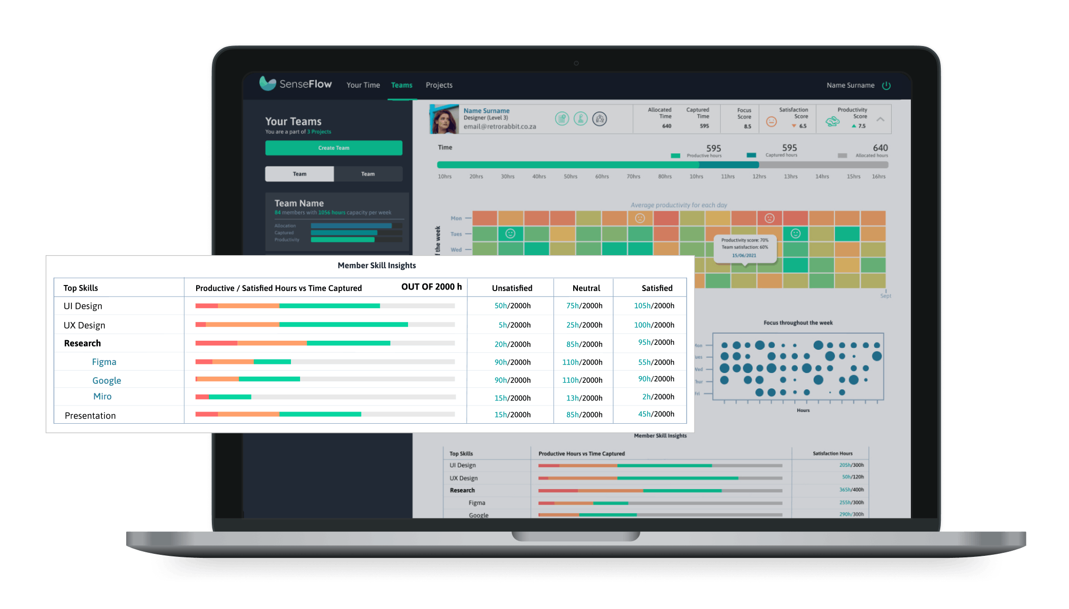
Below the member skill cards, You can view what skills the member most often uses within the team in the member insights table. The colored bar is the hours spent using the skill. Selecting a skill drops down and shows the top applications used for that skill and the hours captured using these applications. The “out of hours” is the member's total hours captured for the selected period. The red bar and 3rd column indicate the hours the member was unsatisfied practicing the skill. The orange bar and 4th column indicate the hours they were neutral. The green bar and 5th column indicate the hours they were satisfied practicing the skill. All three colored bars combined are the time the member was productive.

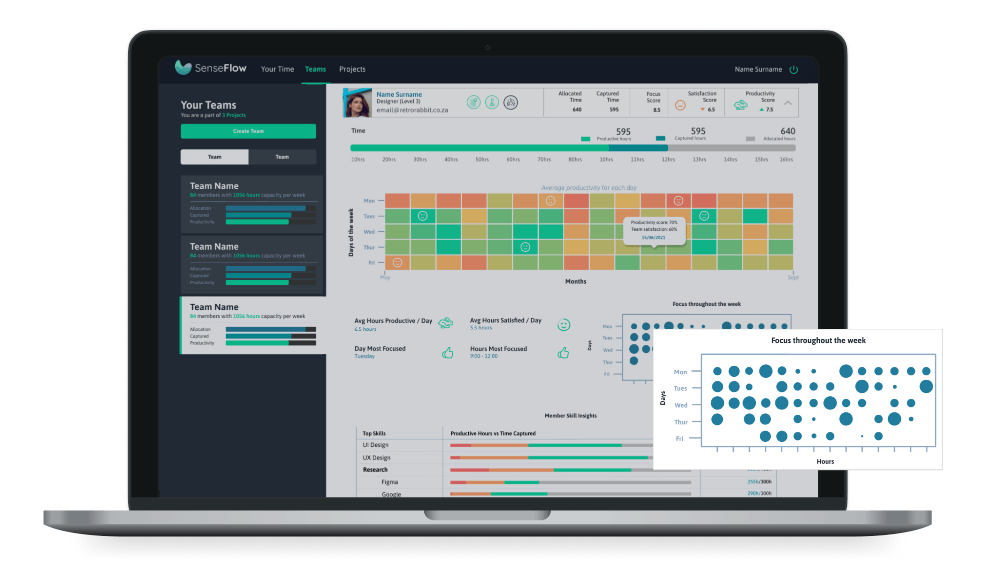
Next to the skills cards, you will be presented with the focus tracker. The circle graph indicated the member’s focus throughout the week. The x-axis shows the hours, and the y-axis shows the days of the week. The size of the circles indicates how focused the member was. You can see what days and when during the day their focus increase or decrease. The more focused the individual was, the bigger the circle would be.