1. Export and share Productivity Report
SenseFlow allows you to export the productivity report for external use.
These buttons enable you to export the selected period information or share it via email.
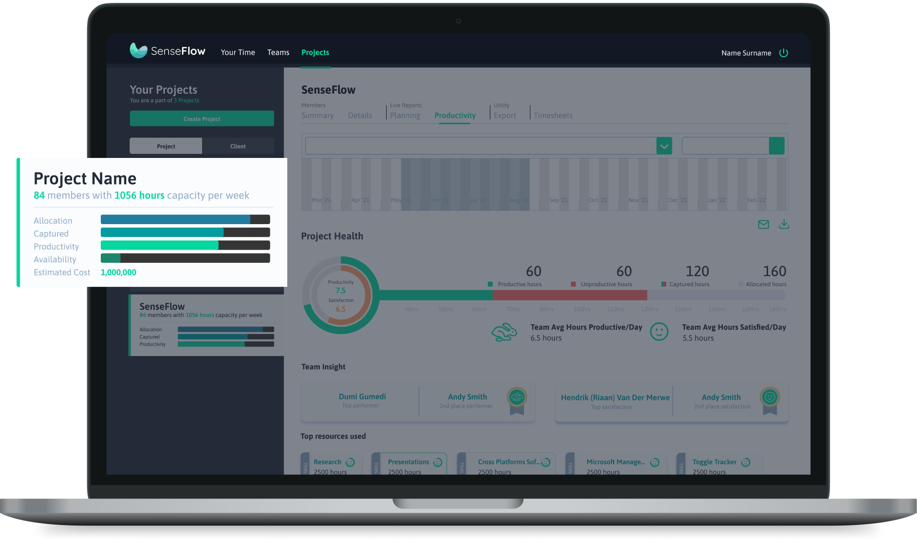
Identify performance patterns in people, processes, and technology that drive success so you can better manage your teams and increase productivity. See insights in real-time.
Collecting the right metrics and understanding how it relates to indicators across the project is the first step towards increasing organization-wide productivity. SenseFlow's productivity report helps you visualize and make sense of your projects and teams well-being.

SenseFlow allows you to export the productivity report for external use.
These buttons enable you to export the selected period information or share it via email.

Within SenseFlow you can view the team performance pattern within the project productivity report, such as the project health bar. The project health bar shows you an overview of the team productivity, satisfaction, and hours.
Within the health bar, the productivity and satisfaction in the circle get measured out of ten.
Hours allocated and captured it shown on the bar.
The green bar is the productive hours captured, and the red bar is the unproductive hours.

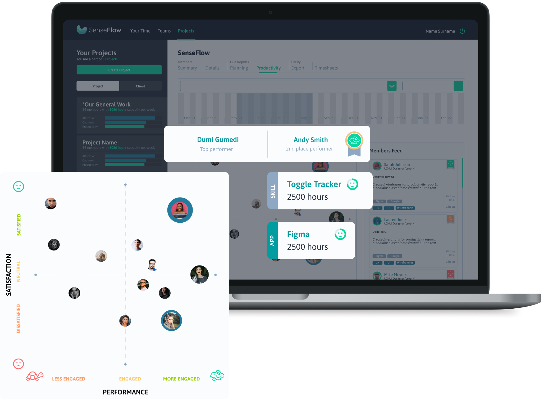
Each member gets a productivity and satisfaction score out of 10 for the selected period. The top productive members are at the top under team insights.

Top member journal entries along with skills and applications used can be found in members' feeds.
The card shows when the entry was created and how long the task took.
The green, orange, and red tags indicate the satisfaction score value.
5 < red
5 > 7 orange
7 > green

The line graph shows you the satisfaction of the team members for the selected period.
The x-axis is the period you selected, and the y - axis the satisfaction level out of 10.
Each team member’s satisfaction within the project over a selected period is represented by a line.
Selecting a line greys out other member’s lines and highlights the member selected.
The member card shows you their name, surname, satisfaction score, and date.

The heat graph shows you the average productivity of the team for each day.
The x-axis shows the period selected, and the y - axis the days of the week.
Productivity is indicated through colours:
Red = unproductive
Orange = neutral
Green = productive
Scores are measured out of 10 and assigned a colour.
5 < red
5 > orange
7 > green

Member tabs provide a quick overview of the individual within the project. It shows you the member's name, surname, email address, and the badges they have earned. On their tab, you can also see the Allocated time and what has been captured (hours). You will be able to see the member’s focus score, satisfaction score, and productivity score for the selected period. These scores are out of 10.
You can click the dropdown arrow to expand the member to view their data.
The time bar indicates the member’s hours. It represents the individual’s allocated hours. The blue bar shows the number of hours they have captured, and the green bar shows you the number of hours they were productive out of the hours captured.

The heat graph shows the member’s average productivity for each day.
The x-axis shows the period selected, and the y - axis the days of the week.
Productivity is represented through colours:
Red = unproductive
Orange = neutral
Green = productive
Scores are measured out of 10 and assigned a colour.
5 < red
5 > orange
7 > green

Skill cards are found under the member's data.
These cards show you the average hours they are productive, satisfied, and focused. You will also be able to view which days of the week are most productive.
This helps you get a summarised view of the member’s working habits.

You can view what skills the member most often uses within the project. The coloured bar is the hours spent using the skill.
Selecting a skill drops down and shows the top applications used for that skill and the hours captured using these applications.
The “out of hours” is the member's total hours captured for the selected period.
The red bar and 3rd column indicate the hours the member was unsatisfied practising the skill.
The orange bar and 4th column indicate the hours they were neutral.
The green bar and 5th column indicate the hours they were satisfied practising the skill.
All three coloured bars combined are the time the member was productive.

The circle graph indicated the member’s focus throughout the week.
The x-axis shows the hours, and the y-axis shows the days of the week.
The size of the circles indicates how focused the member was.
You can see what days and when during the day their focus increase or decrease. The more focused the individual was, the bigger the circle would be.

Click on "projects" on the top navigation bar.
Select the project whose productivity report you want to view.

Select "productivity" under live reports to view the productivity report.

You can drag the bar on the date range to view the productivity report information for a specific period.

Click the envelope icon to email the report. To export the report you can select the download icon.
You can select multiple cards at the top of the team grid. Clicking on the cards will highlight in blue the members in the grid associated with the skills or applications used. These cards are the top team performers, skills, and applications used for the selected period on the date range.

You can click on a member's photo in the grid to show you their name, surname, productivity score, and satisfaction score.

Click on the dropdown arrow on the "team satisfaction" bar to view the team satisfaction graph. Here you can view the entire team satisfaction trend for the selected period.

You can click on a line in the graph to highlight the member associated with the trend. This will gray out other lines and show you the selected member's photo, name, surname, satisfaction score, and date. You can hover over the line to show the date of the associated score.

Click on the dropdown arrow on the "team productivity through week" bar to view the team productivity graph. Here you can view the entire team average productivity trend during a week.

The graph shows you which days of the week the team is productive in the selected period. The green blocks are when they are most productive and the red and orange blocks show you when they are less productive.
You can click on a block to show you the date and productivity and satisfaction score for that day.

Click on the dropdown arrow on the member card to expand their profile and view their individual performance information. Member cards provide a summarised overview of the member's performance in the project.

You can click on one of the blocks in the graph to show you what the individual's productivity and satisfaction score was for that day. The member productivity graph shows you what days of the week they are more productive and when/where their productivity drops.

You can select the top skills in the table to show you what applications were used for this skill. Selecting the skill will make it bold and the applications will drop down underneath to show you the time spent on each application. The example used in the image is "research". Selecting research showed that Figma, google, and Miro were used.
The gray bar is the time captured and the green, orange and red represent the time the individual was productive. The colors are associated with how satisfied the individual was using the skill or application. Red is when they were unsatisfied, orange neutral, and green is when the member was satisfied.
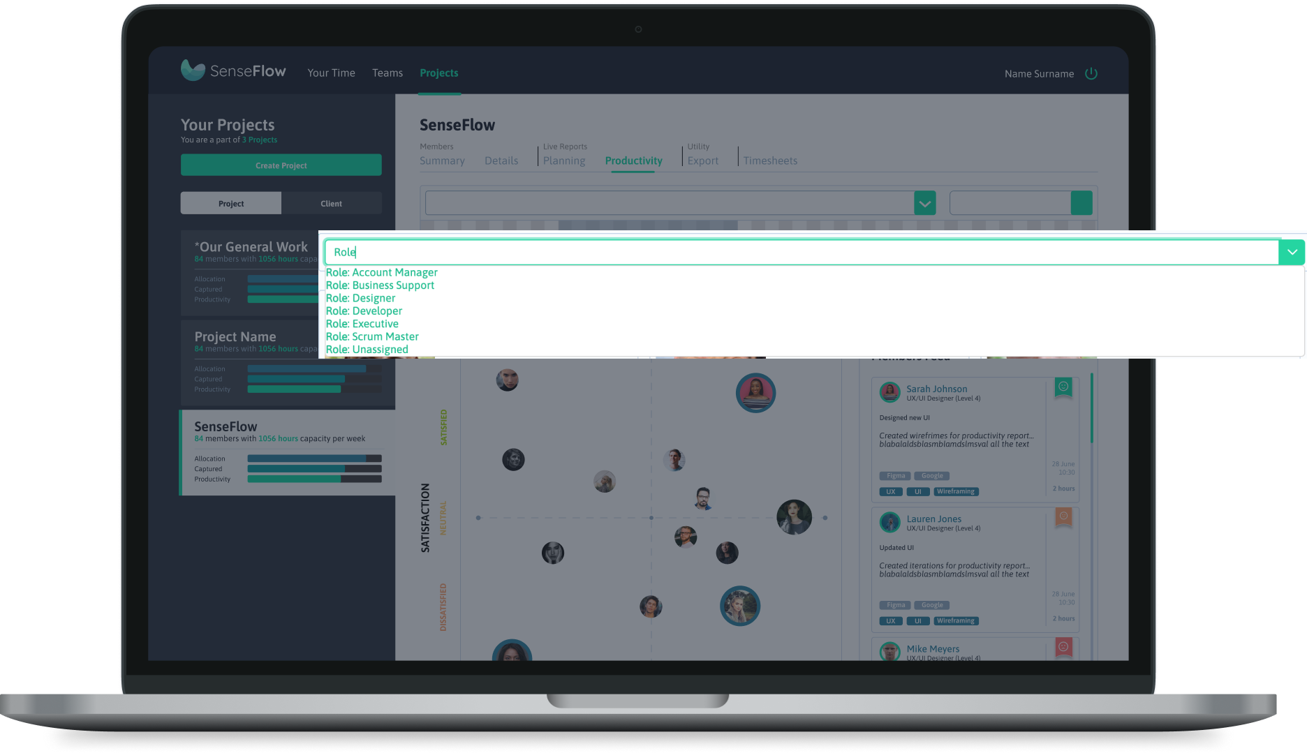
Click on the dropdown arrow on the search bar to view filter options, or you can start typing a specific member name, role, level, or skill. The member cards will be filtered by selected tags.

You can select from the dropdown more than one filter option. The filter options selected will appear in the search bar. To remove a filter "tag" you can click on the X to delete it.

